
Haptic
Brand identity
Motion design
Haptic AI needed a visual identity that felt human in a category that defaults to cold and interchangeable. We built a tactile brand system (wordmark, icon grid, campaign surfaces, and motion) that makes an abstract AI product legible and trustworthy.
Why this, why now
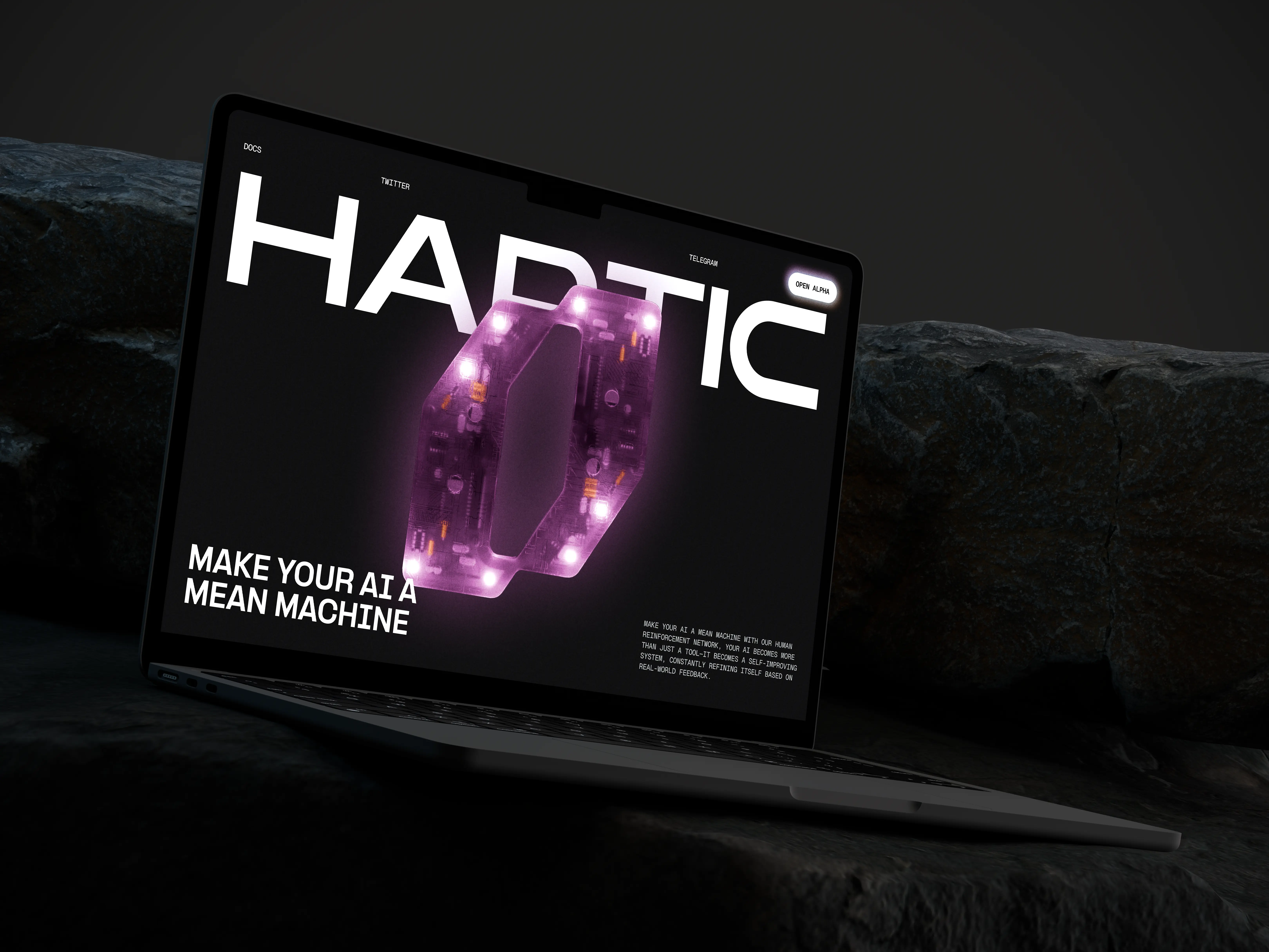
AI products are arriving faster than the visual language to describe them. Most land in the same place: gradient blobs, generic sans-serif, and a name that could belong to any startup on the block. The category has a sameness problem, and users feel it before they can name it. Haptic AI came to us with a product that was genuinely different, but a brand that didn't yet show it. The challenge wasn't to decorate an AI company. It was to give people something to hold onto: a mark, a tone, a system that felt tactile in a space that often feels weightless. We started from a simple premise. If the product promises to make complex things feel within reach, the identity should do the same work before anyone opens the app.
Positioning before pixels
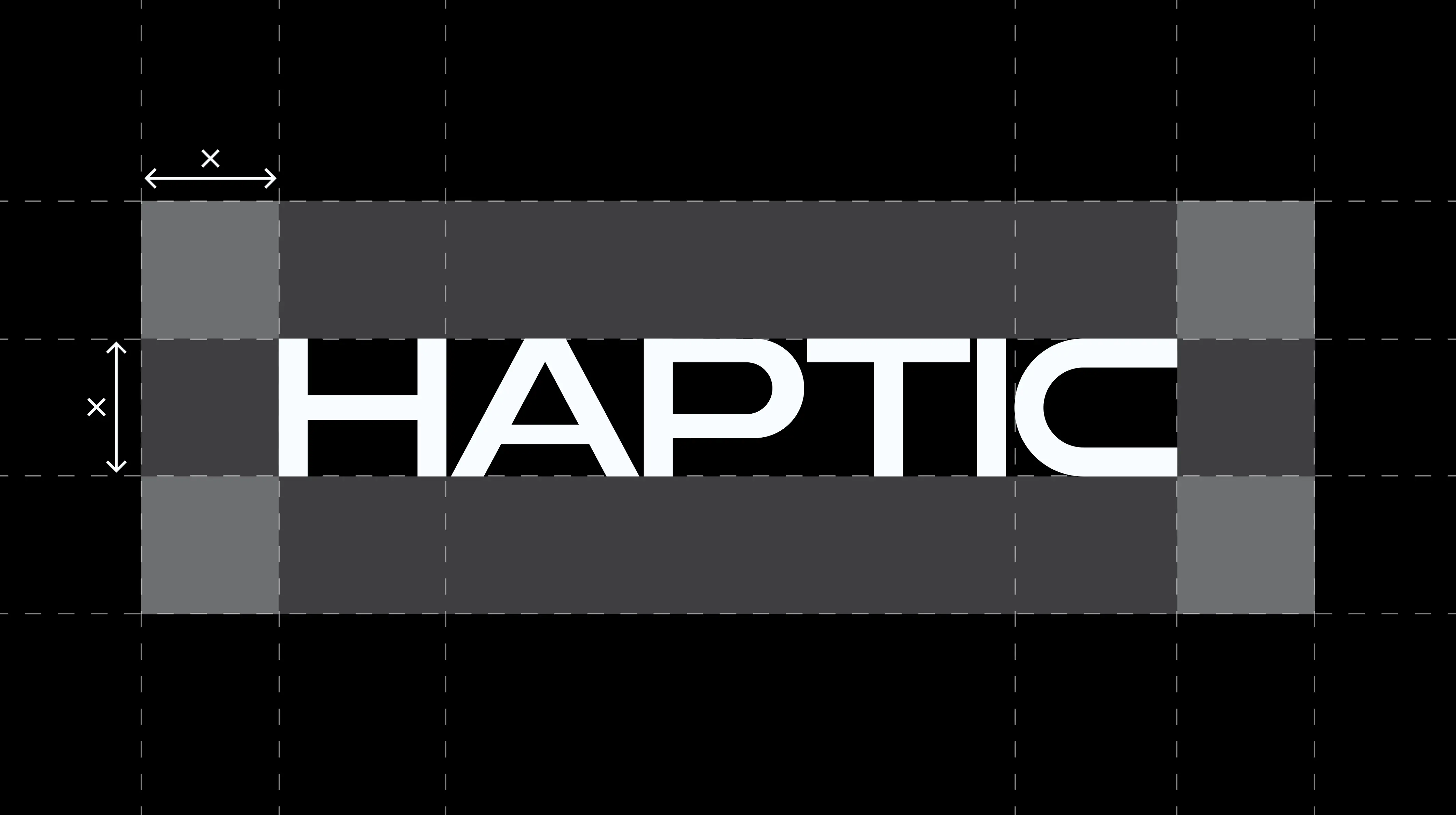
Before any marks were drawn, we mapped how people actually relate to AI tools: the curiosity, the hesitation, the moment of trust when something just works. Users weren't asking for more futuristic. They were asking for clarity: something that felt designed for them, not demoed at them. That research shaped the positioning: Haptic as the interface between human intent and machine capability. Not a black box, not a chatbot costume. A product with a visible hand on the other side. The wordmark became the first expression of that idea. Custom letterforms with enough weight to feel grounded, enough openness to stay approachable. It had to work at billboard scale and favicon size without losing its character.
A system, not a logo
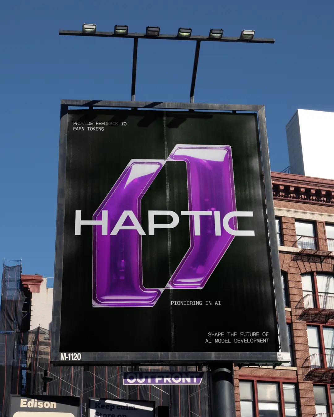
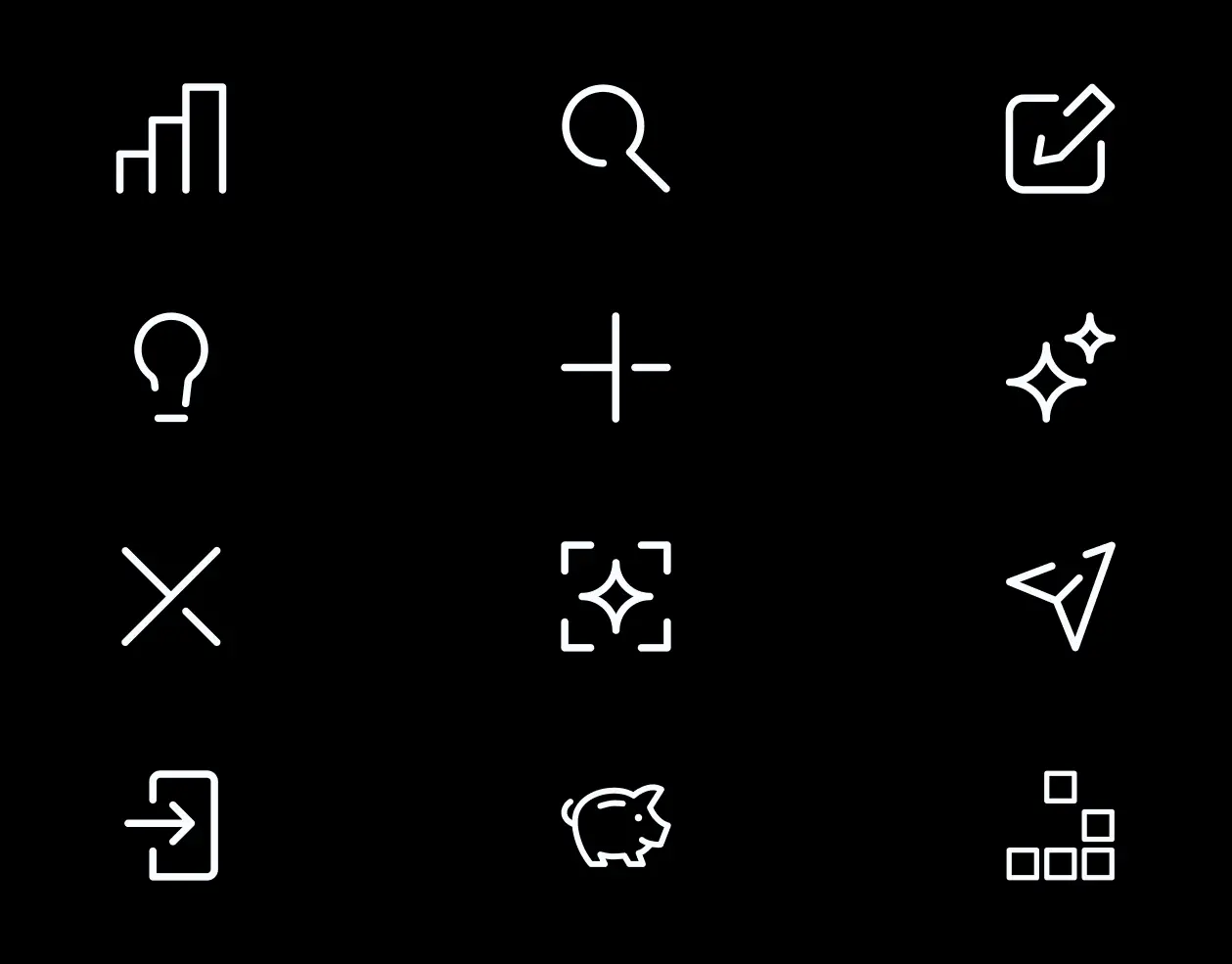
Identity work that stops at a logo rarely survives contact with a real product. We built Haptic as a system: a wordmark, an icon grid for product surfaces, and campaign art that could carry the same voice into the wild. The icon set was designed as a modular grid: each glyph readable at small sizes, consistent in stroke and corner language, flexible enough to grow with the product roadmap. The billboard treatment extended the palette and typography into a single campaign surface: bold, legible, unmistakably Haptic from across a street. Every asset had to answer the same question: does this make the product feel more real, more reachable, more like something you'd actually use?
Motion as identity
Static marks only tell half the story for a product that lives in motion. The reveal animation became the bridge between brand and product, a short sequence that introduces the wordmark, unfolds the icon system, and lands on the hero image with the same tactile confidence as the rest of the identity. We treated motion as a design material, not an afterthought. Timing, easing, and the order of appearance were tuned so the reveal feels intentional, like the brand is introducing itself, not loading. The result is an identity that works across touchpoints: a wordmark you remember, icons you recognise, campaign art that stops the scroll, and motion that ties it all together when Haptic shows up for the first time.